Skip to main content
vis·u·al
AmE /ˈvɪʒ.u.əl/ · BrE /ˈvɪʒ.u.əl/
adjective
Relating to seeing or sight; perceived or presented in a form the eye can read.
for·mal de·mog·ra·phy
AmE /ˈfɔːr.məl dɪˈmɑː.ɡrə.fi/ · BrE /ˈfɔː.məl dɪˈmɒɡ.rə.fi/
noun
The study of demographic quantities — fertility, mortality, migration, age structure, and population growth — as a self-contained system, through the internal relationships among them and apart from their social, economic, or biological causes.
The mathematics of population, made to explore.
Visual Demography works in that formal tradition to build interactive pieces for learning. Each piece exposes the parameters of a single model (a life table, a stable population, a projection, a kinship network) so that changing an assumption changes the result on screen. Inputs may be observed, stylized, or reconstructed, and each companion names which.
These are explanatory instruments, not research findings. They apply standard demographic methods to show how rates and structures propagate through formal models. Stylized or reconstructed inputs are flagged on each companion page.
Demographic Flux
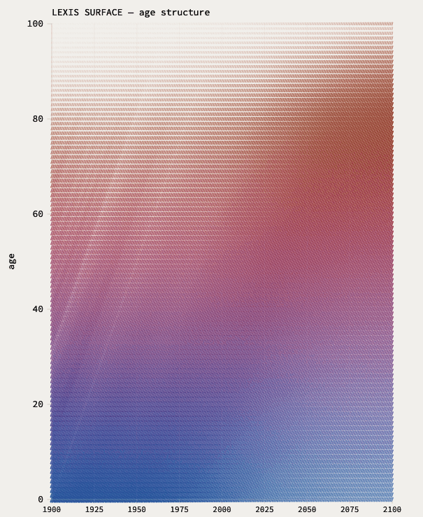
Cohort-component Lexis simulation from observed HMD/HFD country profiles — stylized forward scenario, not recorded national history after the base year.
Choose a country profile, then explore how the observed base-year age structure and vital rates evolve under Lee–Carter mortality and a parametric fertility path; strip panels trace birth and death rates together, crude growth rate, and the first demographic dividend.
Explaining the differences in life expectancies
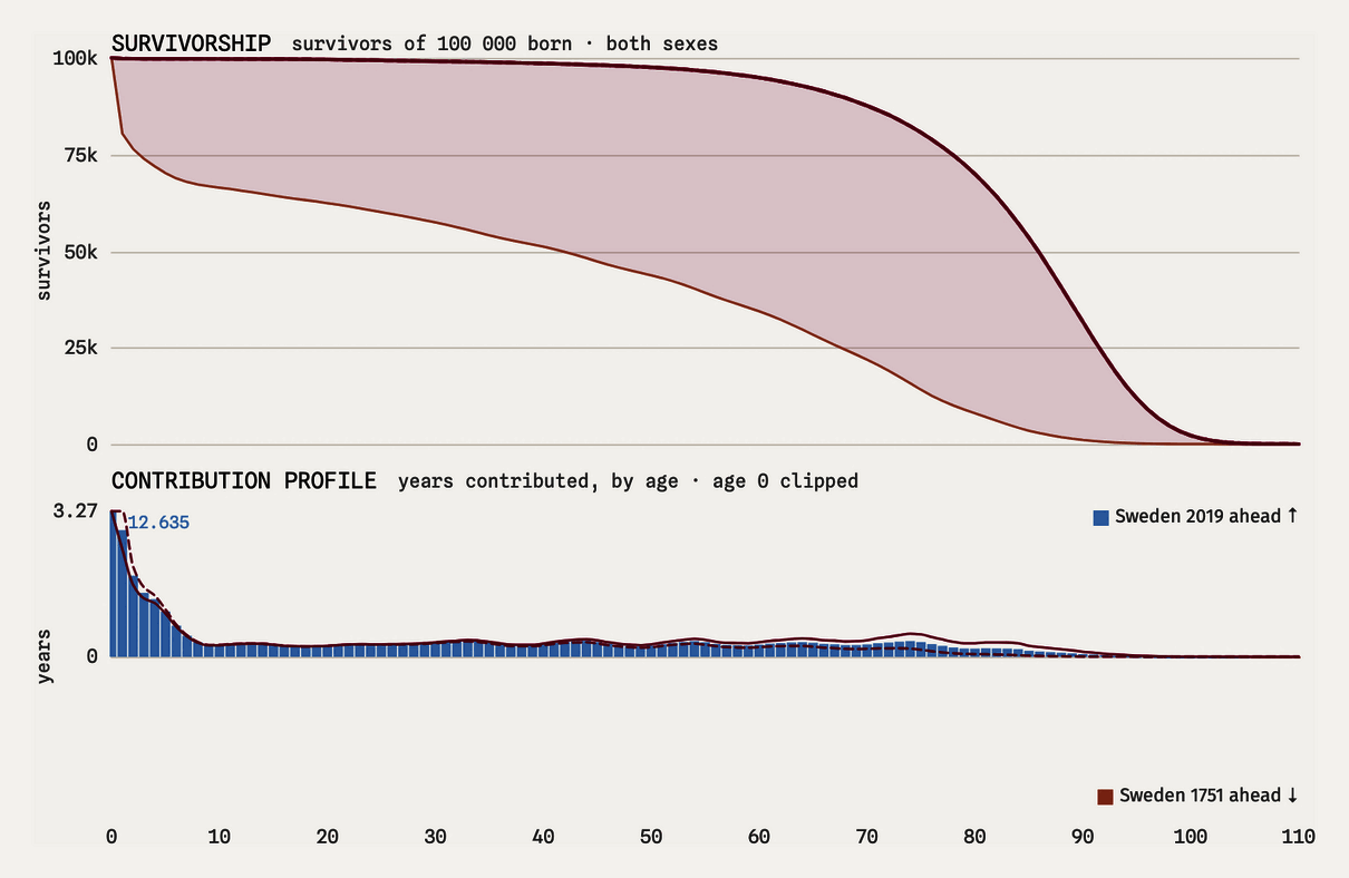
Arriaga's decomposition of a difference in life expectancy into the contribution of each single year of age, drawn as two replacement fronts converging from opposite ends of the age axis.
Choose any two observed HMD female life tables — the same year in two countries for a geographic difference, or the same country in two years for a temporal one — and watch the gap resolve age by age. Contributions sum to the whole difference exactly, and the closure error printed under the panel is floating-point noise.
Which causes account for a difference in life expectancy
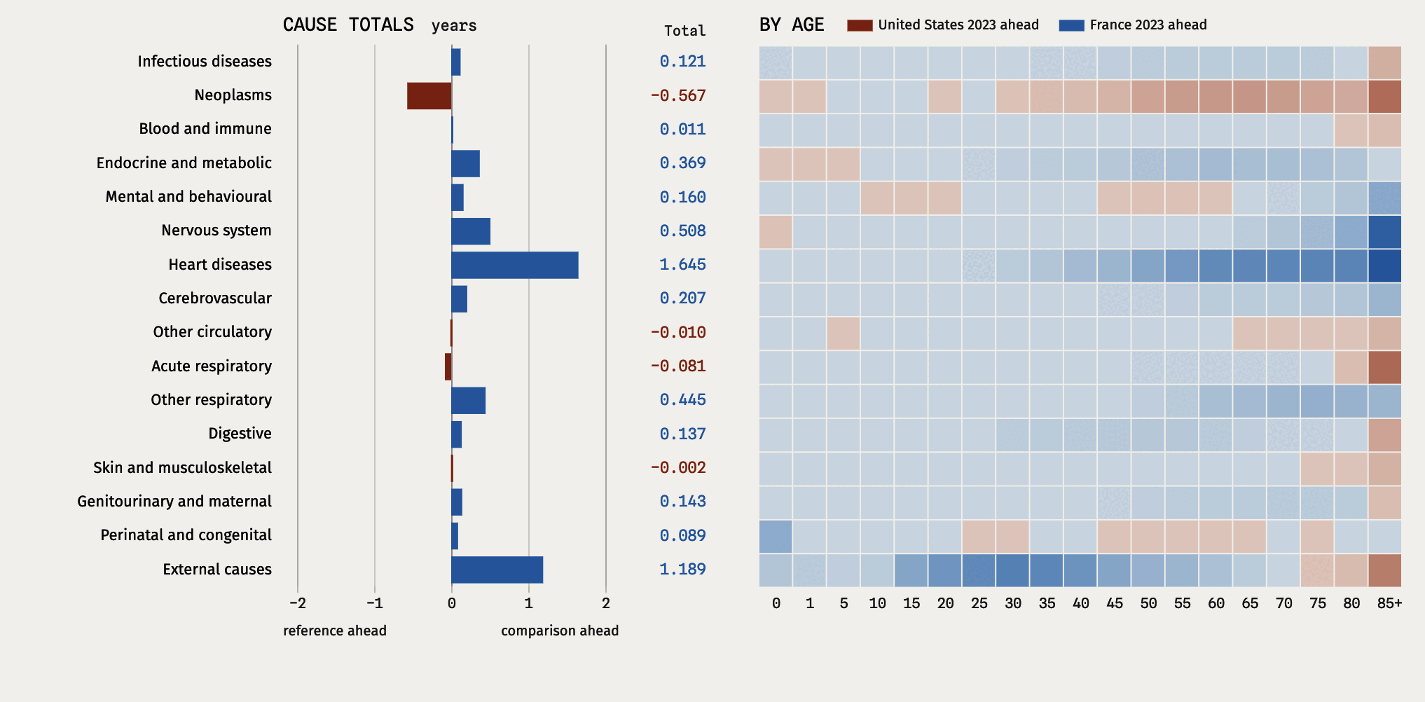
Arriaga's decomposition of a difference in both-sex period life expectancy, constructed here from the Human Cause-of-death Database (HCD) reconstructed short list, into sixteen cause groups: each bar is that row's total on a nineteen-band heatmap.
Either country-year can be anything in the list of 795. Choose the same year in two countries and the differential is geographic; choose the same country in two years and it is temporal. Life expectancy is built here from the sixteen cause rates and HCD exposures. The Human Mortality Database (HMD) table is a check. The sixteen cause totals add to that constructed difference exactly.